-
Architects: Archihood WXY
- Area: 499 m²
- Year: 2020
-
Photographs:Park Swan
-
Manufacturers: JUNG, American Standard, Artpage, Benjamin Moore, Eagon
-
Lead Architects: Youngjin Kang, Woohyun Kang

A narrow and deep house - Around 2019, a couple who had purchased a lot in District Godeung, Seongnam, visited us to commission their first house design project. They had worked at the same workplace, and one of them was dreaming of a second life operating a cafe after resignation. Together, we visited the project site, a typical multi-unit housing site within the new town development district. Each of the lots here was just as wide and broad as it could barely accommodate a four-story building with a neighborhood facility and mixed multi-unit housing, and it seemed obvious that the 6m-wide road would soon become like a parking lot.


Around the time when we discussed the commencement of construction, here and there, completed buildings appeared. Most of them were placed closest to the road to maximize the floor area ratio, while creative loft design techniques were diversifying the neighborhood skyline to the point of looking dizzy to the eyes.


We had previously experienced a similar site condition when working on the Gap House project, in which we had proposed the courtvard and the long and narrow balcony as a solution. The lot of this Godeung-dong project was about 12 meters wide, so it was extremely mind-boggling to put just a parking lot, let alone the courtyard. The only solution left for us seemed to be the long and narrow balcony and placing the building far from the road. Given the 6m-wide front road was not enough to block the view from across the road, we made efforts to distance the front of the building as far from the road as possible. In the same vein, we put the long and narrow balcony at the center of the house instead of a large one at the front and designed the front windows also in a long and narrow form so as to minimize the scope of being viewed from a distance.


As soon as we started the design, however, we met with great difficulty: given the regulation for solar access applying to this 12m-wide site, we were unable to use half of the 4th floor. As the general implicit formula for this kind of housing was the shop on the 1st floor, rental housing on the 2nd to 3rd floors, and the owner's house on the 4th floor, our client was deeply disappointed that half of the 4th floor was unavailable. Unavoidably, we decided to use half of the 3rd floor as well as the 4th floor for the client's house. By placing bedrooms on the 3rd floor and the living space on the 4th floor, with the broad roof garden occupying half of the 4th floor, we wanted to give the feeling of living in a detached duplex house.


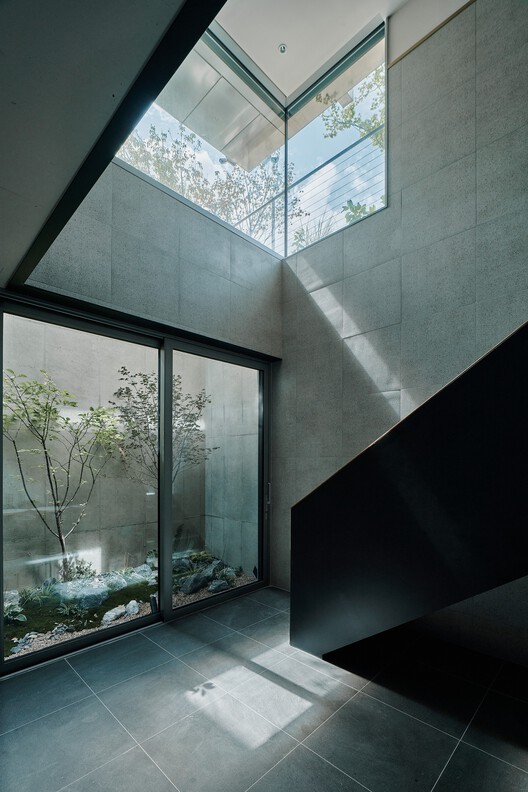
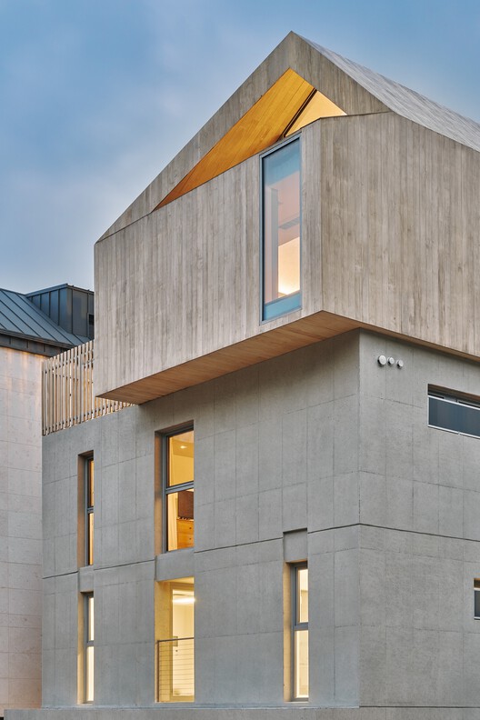
As the future of this neighborhood was so clearly predicted, we proposed to use such materials as others are unlikely to use, but as placid and inartificial ones. We persuaded the client of our proposal to combine hardwood with the exposed concrete cast in Euroform by adding a non-assured story that would facilitate structural consulting engineers in the sale of rental housing. Fortunately, the story became real. Amongst all kinds of flashy houses, this house solely looked placid, particularly its 4th floor, which was all covered with akoya and looked like a wooden box, became a distinct symbol of this house. For the walls and ceiling at the 1st-floor entrance, glossy stainless steel was used to turn the low ceiling height to the advantage of design.


